

Introduction
Shapash lets you create a beautiful web app for interpreting your machine learning models in seconds as soon as you have the model ready. You don’t have to spend time creating web applications of your own. This saves a lot of time for you and your team. Isn’t this exciting? If you are reading till this point then I am sure you are interested in this.
Explainable AI (XAI)
Explainable AI refers to the tools and techniques that can be used for making machine learning models interpretable. So that the models are understood by human experts which in turn helps in decision making. There are a number of tools or packages available such as SHAP, LIME, Skater, Interpret ML, etc. in the eXplainable AI market.
Then there are other types of packages (overlay packages) such as Shapash that are built on top of SHAP and LIME but provides additional features that are not found in the original package. For example, using Shapash you get explanations for your model’s predictions, and at the same time, it provides an out-of-box web app to visually interpret your ML predictions.
If you are interested in learning how to use SHAP and LIME for interpreting your machine learning models, I recommend the below resources.
Now that you have got some background on eXplainable AI and Shapash, let’s see how to use Shapash for interpreting your model predictions.
Shapash
Shapash builds a web app out-of-the-box for interpreting your machine learning model predictions. These explanations help everyone from data scientists, business owners, regulators, end-users, customers either directly or indirectly. You can also get these visualizations in the Jupyter notebook. As of this writing, Shapash supports most of the Scikit-learn models XGBoost, LightGBM, Catboost, etc.
Installation
The installation is pretty straightforward and the below command will install Shapash and all the dependencies.
pip install shapash
Implementation
The crux of Shapash lies in two objects SmartExplainer and SmartPredictor that help you in interpreting your machine learning predictions. Let’s work through the red wine quality dataset in the below example.
Step 1 - Build the model
The first step is to build the model. Using the red wine quality dataset let’s build the Random Forest Regressor model. To keep it simple, default parameters are used and no hyperparameter tuning is done.
					import shap
import pandas as pd
import numpy as np
import matplotlib.pyplot as plt
from sklearn.model_selection import train_test_split
from sklearn.ensemble import RandomForestRegressor

dataset_url = 'https://archive.ics.uci.edu/ml/machine-learning-databases/wine-quality/winequality-red.csv'
df = pd.read_csv(dataset_url, sep=';')

y = df['quality']
X = df[['fixed acidity', 'volatile acidity', 'citric acid', 'residual sugar','chlorides', 'free sulfur dioxide', 'total sulfur dioxide', 'density','pH', 'sulphates', 'alcohol']]

X_train, X_test, y_train, y_test = train_test_split(X, y, test_size = 0.2, random_state=42)

model = RandomForestRegressor(max_depth=6, random_state=42, n_estimators=10)
model.fit(X_train, y_train)

y_pred = pd.DataFrame(model.predict(X_test),columns=['pred'], index=X_test.index)
Step 2-Create SmartExplainer
The next step is to create a SmartExplainer object.
					from shapash.explainer.smart_explainer import SmartExplainer
xpl = SmartExplainer()
Step 3 - Compile
In the next step, you run the compile method. The compile method expects two mandatory parameters: model & test data. It also provides additional optional parameters such as preprocessing, postprocessing, etc.
xpl.compile(x=X_test, model=model, y_pred=y_pred)
Step 4 - Launch, Stop and Serialize
Step 4a) Launch the web app
Next, you can launch the web app by running app_run() method on SmartExplainer object.
app = xpl.run_app(host='localhost')
A new web page will open in your favorite browser where you can get model explanations. The web app contains 3 types of visualizations — Feature Contributions, Feature Importances, Local Interpretations, and Test data.
There are two types of explanations — Global Explanations and Local Explanations. Feature importance and Feature Contributions give global explanations (overall model performance) and local explanations give interpretations for individual predictions.
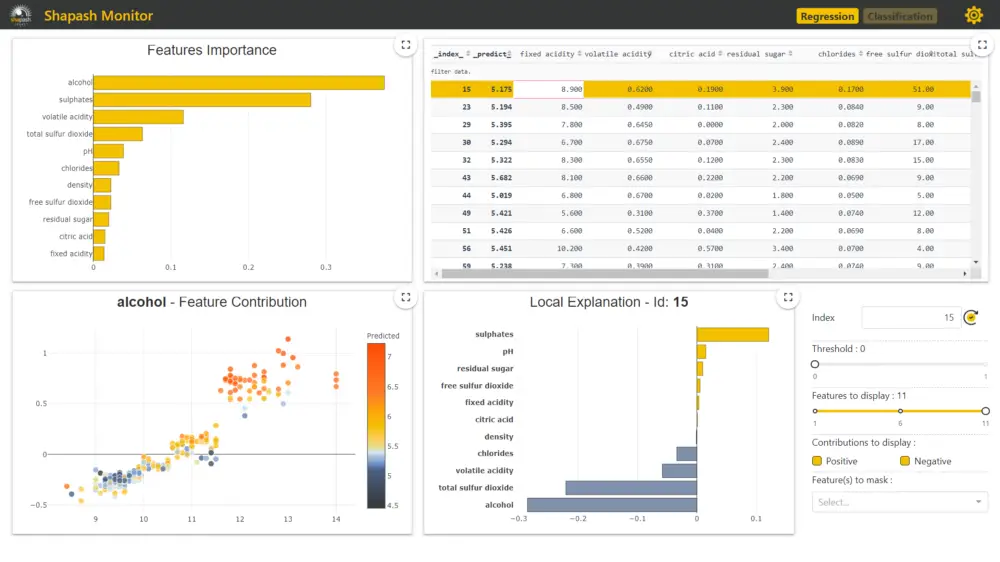
Please refer to Step 5 below on how to read these visualizations to interpreting the model’s predictions.
Step 4b) Stop the service
After reviewing the model interpretation, if you are happy with the results, you can stop the service by running the kill() method.
app.kill()
Step 4c) Serialise SmartExplainer
An important feature is you can serialize the SmartExplainer object (xpl). Next time you can just use pickled object and launch the web app instantly.
					# Save
xpl.save('RedWineQuality_xpl.pkl')

# Load
xpl = SmartExplainer()
xpl.load('RedWineQuality_xpl.pkl'
Step 4d) Export contributions to Pandas DataFrame
Using the to_pandas() method on the SmartExplainer object, you can export the feature contributions to DataFrame. Additionally, you can control the number of features to be included in the summary_df using the filter() method.
summary_df = xpl.to_pandas(max_contrib=3)
Step 5 - Visualizations in Notebook
In step 4b, you have seen 3 types of visualizations for interpreting your model’s prediction. You can also get these visualizations in the Jupyter notebook along with additional features.
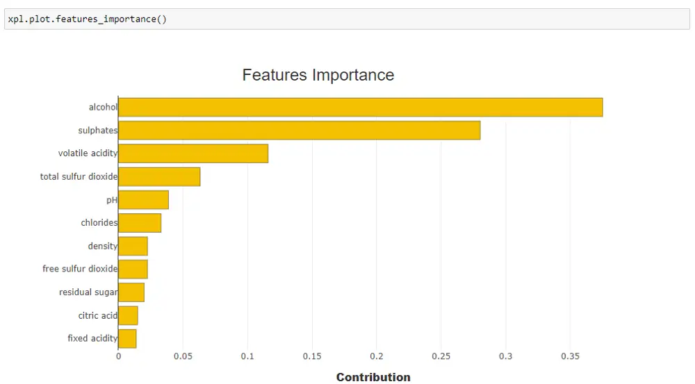
Feature Importance
Using, xpl.plot.features_importance(), you can get feature importance visualization. As per the feature importance plot below, alcohol and sulphates are the two most important features for predicting the quality of the wine.
Feature Contribution
Using xpl.plot.contribution_plot(), you get a contribution plot as shown below. The below diagram shows the contribution plot for the feature the ‘alcohol’. The plot shows that as the alcohol content increases the quality of the wine also increases. By replacing alcohol you can get contributions for other features.
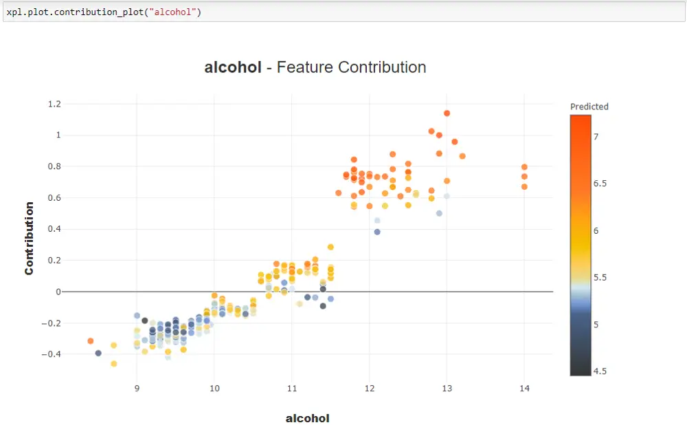
In the web app, by default, you get a contribution plot for the feature with the highest feature importance (‘alcohol’ in our example). By clicking on different features you get a feature contribution plot for that feature.
Local explanation
Using xpl.plot.local_plot(), you get local explanations for individual instances. In the below example, you get a local explanation from the test data with index 803 — sulphates feature has high positive impact while alcohol is having a highest negative impact on this prediction.
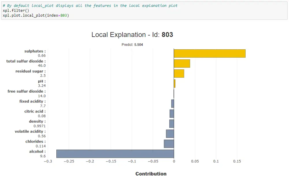
Using the filter() method you can control the number of features to be included in the local interpretation plot.
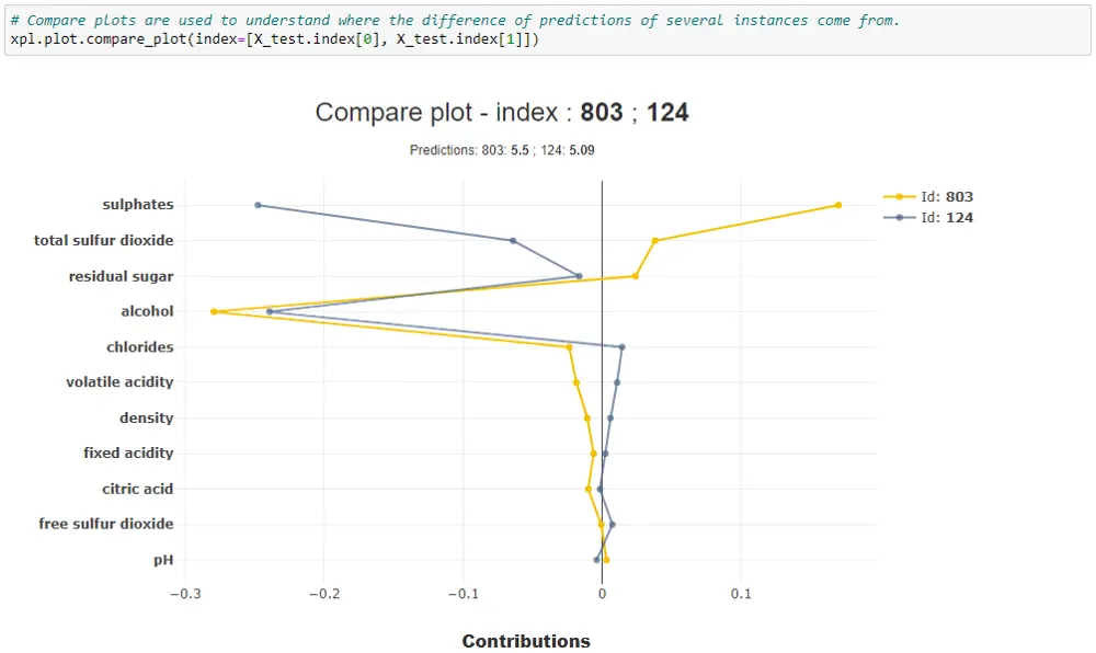
Compare plot
Using xpl.plot.compare_plot(), you get compare plot which helps you understand where the differences of predictions of several instances come from.
Step 6 - SmartPredictor for deployment
Are you happy with the explanations provided by Shapash? Now you can use SmartPredictor object for deployment. Let’s see the features of SmartPredictor.
Step 6a) Serialize and Load SmartPredictor
Similar to SmartExplainer, you can serialize the SmartPredictor object and load it as needed.
					predictor.save('predictor.pkl')

from shapash.utils.load_smartpredictor import load_smartpredictor
predictor_load = load_smartpredictor('predictor.pkl')
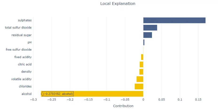
Step 6b) Explain new data using SmartPredictor
Let’s say that you have deployed SmartPredictor in production. How do you use it to get explanations for the new data that is coming in? This is done by passing new data to add_input() method on SmartPredictor. Then you need to run detail_contributions() method which gives individual contributions for each feature. For testing, I’ll be using the first record from the X_test.
					predictor_load.add_input(x=X_test.head(1))
detailed_contributions = predictor_load.detail_contributions()
Step 6c)- Local explanation on new data
Shapash doesn’t support getting local explanations using local_plot yet (however, as of this writing, they are trying to add this functionality soon). in the meanwhile, you can get local explanations using the below code.
					import plotly.graph_objects as go
from plotly.graph_objs import *

df = detailed_contributions.drop('ypred', axis=1).T.reset_index()
df.columns= ['features', 'contribution']
df = df.sort_values(by='contribution', ascending=True)

df['color'] = np.where(df['contribution']<0, '#f4c000', '#4a628a')

fig = go.Figure(go.Bar(x=df['contribution'], y=df['features'], orientation='h', marker_color=df['color']) )
fig.update_layout(template='plotly_white', title='Local Explanation', title_x=0.5)
fig.show()
Conclusion
In this article, you have understood how to build a beautiful web app in few seconds for interpreting your machine learning models using Shapash. As you just went through Shapash has a lot of advantages as mentioned here. Shapash documentation and tutorials are very high quality and self-explanatory. I have given the link in the references section below and I suggest you go through all of them to get the most out of Shapash.
