
Introduction
During the EDA (Exploratory Data Analysis), we create the plots such as scatter plots, violin plots, box plots, etc. to understand the distribution of the data.
If you are dealing with only a few plots then it won’t be a problem. But, if you are dealing with many features then creating multiple plots is not ideal. Instead, you can create subplots (i.e. multiple plots in the same figure). So, how do you create one?
In this blog post, we will understand how to create subplots in Python using plt.subplots(). The Jupyter notebook is provided at the end of the article.
What are subplots
In simple terms, subplots are the multiple plots that exist in the same Matplotlib figure. Note that even though we are using Seaborn in the blog for plotting, it’s basically Matplotlib figure because Seaborn is built on top of Matplotlib.
How to create subplots in Python
In order to create subplots, you need to use plt.subplots() from matplotlib. The syntax for creating subplots is as shown below —
fig, axes = matplotlib.pyplot.subplots(nrows=1, ncols=1, *, sharex=False, sharey=False, squeeze=True, subplot_kw=None, gridspec_kw=None, **fig_kw)
nrows, ncols — the no. of rows and columns of the subplot grid
sharex, sharey — share the values along the x-axis (sharex) and y-axis (sharey). The possible values are ‘all’, ‘none’, ‘row’, and ‘col’.
squeeze — If True, axes are returned as 2D arrays. If False, Nx1 & 1xM axes are returned as 1D and NxM are returned as 2D.
fig_kw — Additional parameters from plt.figure() that can be passed to subplots
subplot_kw and gridspec_kw are the advanced features to create subplots. For the simplicity of the article, we are not discussing these 2 parameters in this article.
Starting with empty subplots
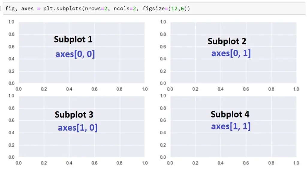
To create subplots, first you need to understand nrows and ncols parameters. The nrows indicate the number of rows in the subplot grid and ncols indicate the number of columns in subplot grid. Let’s say you want to create 4 subplots with 2 plots in each row then nrows=2, and ncols=2.
I hope that the below diagram gives you a good understanding. You can play around with nrows and ncols to understand how it works.
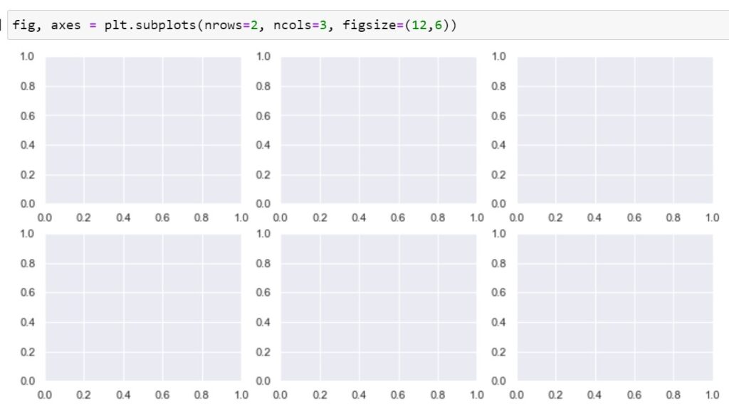
Let’s see another example similar to the above. This example has 6 subplots with 3 plots in each row.
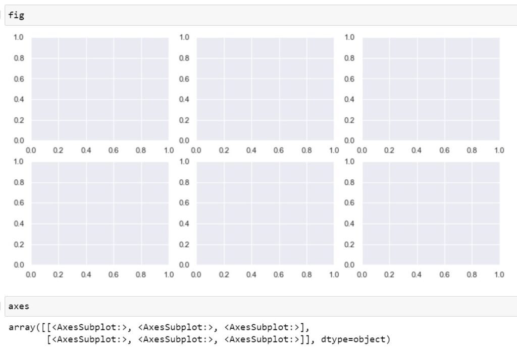
The plt.subplots() returns two objects namely fig and axes. Fig is nothing but the skeleton you saw above. By using the axes you can fill up all the plots. The below code confirms the same.
So far only saw how to create empty subplots. Let’s find out how to create subplots with actual data.
Working with the "iris" dataset
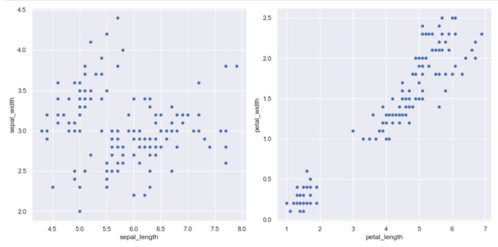
In the below example, we are going to use the iris dataset. Here, we are creating a subplot consisting of 2 scatterplots.
When dealing with nrows=1 or ncols=1 then axes will have a 1D array (if squeeze=True). In order to access these axes when creating the plots, you have to use square bracket notation axes[0], axes[1], and so on.
And then you need to pass each of these axes to the ax parameter to the Seaborn plotting function. The first axis i.e. axes[0] is used to plot sepal length Vs. Sepal width and axes[1] are used to plot petal length vs. petal width.
					import seaborn as sns
import matplotlib.pyplot as plt
sns.set()

df = sns.load_dataset('iris')

fig, axes = plt.subplots(1, 2, figsize=(12, 6))
sns.scatterplot(data=df, x='sepal_length', y='sepal_width', ax=axes[0])
sns.scatterplot(data=df, x='petal_length', y='petal_width', ax=axes[1]);
Output:
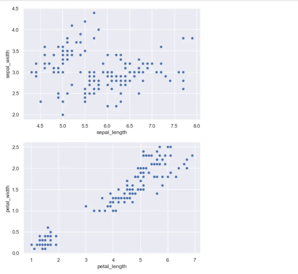
The below example uses nrows=2 and ncols=1. It means that there will be 2 rows and 1 column which is what you see in the below diagram.
					fig, axes = plt.subplots(2, 1, figsize=(6, 12))
sns.scatterplot(data=df, x='sepal_length', y='sepal_width', ax=axes[0])
sns.scatterplot(data=df, x='petal_length', y='petal_width', ax=axes[1]);
Output:
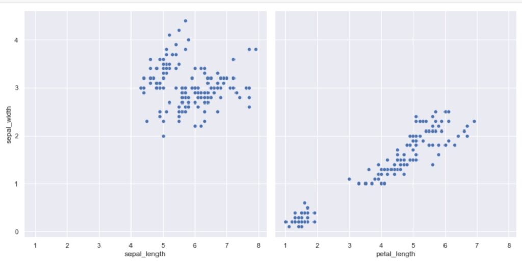
If you can set squeeze=False, then axes will be always a 2D array. In such a case, you can access using square bracket notation axes[row, col]. I prefer this 2D array as it will be consistent whether the squeeze parameter is on or off. Refer to the below example where we are using axes[row, col] notation.
					fig, axes = plt.subplots(1, 2, squeeze=False, figsize=(12, 6))
sns.scatterplot(data=df, x='sepal_length', y='sepal_width', ax=axes[0, 0])
sns.scatterplot(data=df, x='petal_length', y='petal_width', ax=axes[0, 1]);
Output:
Another way to use axes is to unpack them as shown below and use them with the ax parameter. The below code produces the same plot as above.
					fig, (ax1, ax2) = plt.subplots(1, 2, figsize=(12, 6))
sns.scatterplot(data=df, x='sepal_length', y='sepal_width', ax=ax1)
sns.scatterplot(data=df, x='petal_length', y='petal_width', ax=ax2);
The parameters sharex and sharey are also useful when you want to have the same scale on all axes of the plots (either x-axis or y-axis or both). Below is the output after setting both sharex and sharey to True. As you can see both the plot share x-axis and y-axis.
					fig, axes = plt.subplots(1, 2, squeeze=False, figsize=(12, 6), sharex=True, sharey=True)
sns.scatterplot(data=df, x='sepal_length', y='sepal_width', ax=axes[0, 0])
sns.scatterplot(data=df, x='petal_length', y='petal_width', ax=axes[0, 1])
plt.tight_layout();
Working with the "tips" dataset
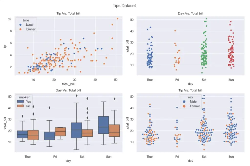
Let’s create subplots using another dataset – the ‘tips’ dataset from Seaborn library. In the below example, we created a 2×2 subplot.
Using the axes object, you can add additional features such as the title for each plot, x label, y label, etc.
					fig, axes = plt.subplots(2, 2, figsize=(12, 8))
plt.suptitle('Tips Dataset')

sns.scatterplot(data=df, x='total_bill', y='tip', hue='time', ax=axes[0,0])
axes[0,0].set_title('Tip Vs. Total bill')

sns.stripplot(data=df, x='day', y='total_bill', ax=axes[0,1])
axes[0,1].set_title('Day Vs. Total bill')

sns.boxplot(data=df, x="day", y="total_bill", hue="smoker", ax=axes[1,0])
axes[1,0].set_title('Day Vs. Total bill')

sns.swarmplot(data=df, x='day', y='total_bill', hue='sex', ax=axes[1,1]);
axes[1,1].set_title('Tip Vs. Total bill');

plt.tight_layout();
Output:
In this blog, you learned how to use plt.subplots() method to create subplots in Python using Seaborn. Hope you found this article useful. Please let me know if you have any questions in the comments section.
