Introduction
Data Visualization is an integral part of business analytics and it helps businesses to get insights & patterns quickly and make data-driven decisions.
Matplotlib and Seaborn are the two most popular Python libraries for data visualization. However, one downside of these two libraries is that both produce static plots. If you are looking for interactive plots then you will have to look for new libraries such as Plotly, Bokeh, etc., and then you need to spend some time understanding the syntax and usage.
But do you know you can also generate interactive plots directly on Pandas using Plotly or Bokeh as the backend? The icing on the cake is that you don’t have to learn syntax and usage of Plotly or Bokeh. Let’s see how we can create interactive plots in Pandas.
How to create interactive plots in Pandas
Interactive plots let you play around with plots like zoom-in, zoom-out, hovering the cursor on the graph to get a tooltip, etc. One of the notable benefits of using interactive plots is that they give a good user experience.
There are 2 ways you can create interactive plots directly on Pandas:
- Plotly plotting backend
- Bokeh plotting backend
Plotly plotting backend for Pandas
The Plotly backend for Pandas supports the following plots of Pandas: scatter, line, area, bar, barh, hist, and box.
There are 2 ways you can plot using Plotly backend for Pandas— df.plot(kind=’scatter’) or df.plot.scatter(). We will be using df.plot(kind=<type>).
Installation & set up
We need to first install Plotly and set Pandas plotting backend to ‘plotly’. Refer to the below code.
					!pip install plotly

import pandas as pd
pd.options.plotting.backend = "plotly"
For the demonstration, we will be using the tips dataset from the Seaborn library. Let’s import the library and load the dataset.
					import seaborn as sns
df = sns.load_dataset('tips')
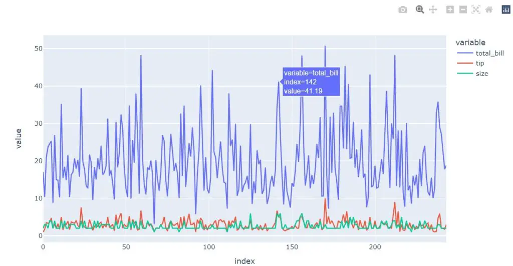
Line plot
df[['total_bill', 'tip', 'size']].plot(kind='line')
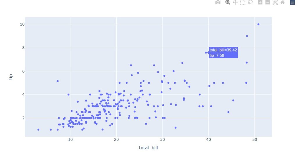
Scatter plot
df.plot(kind='scatter', x='total_bill', y='tip')
Bar plot
df['day'].value_counts().plot(kind='bar')
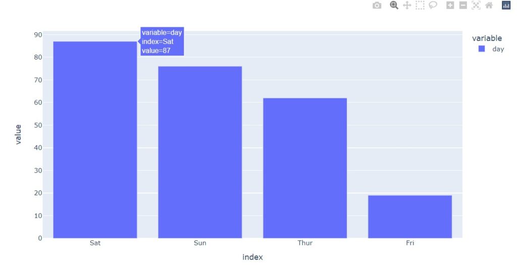
Note that if you pass kind=’barh’, you can get a horizontal bar graph.
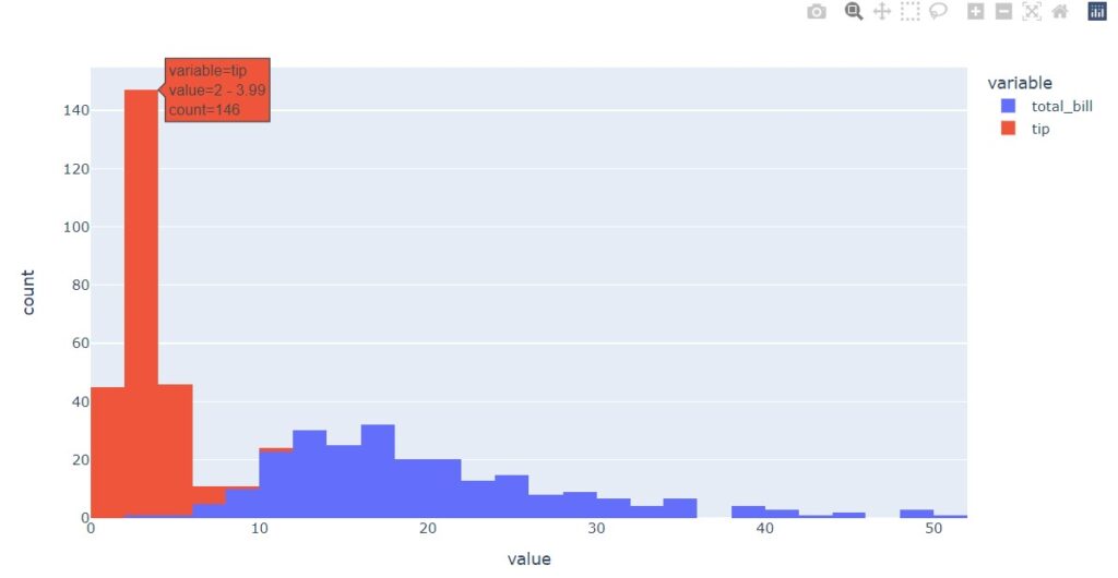
Histogram
df[['total_bill', 'tip']].plot(kind='hist')
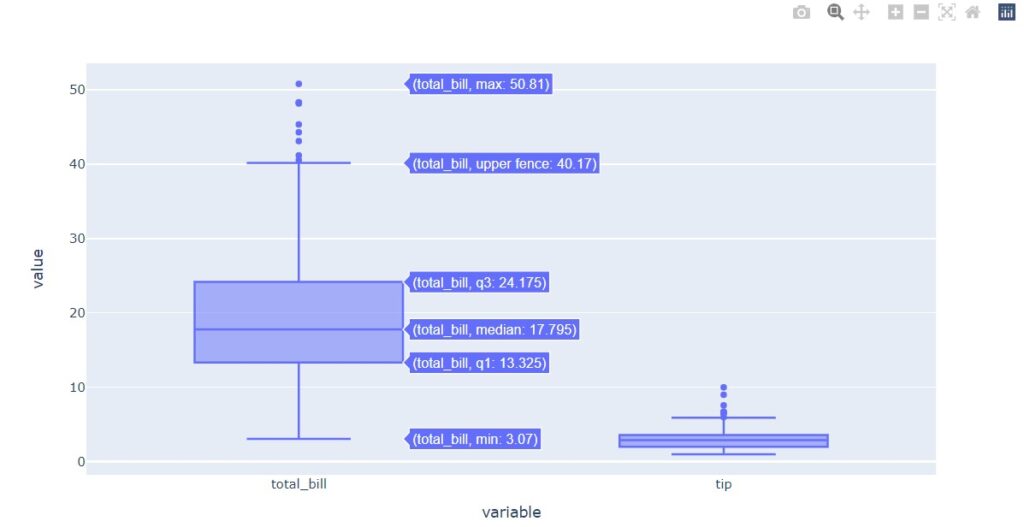
Box plot
df[['total_bill', 'tip']].plot(kind='box')
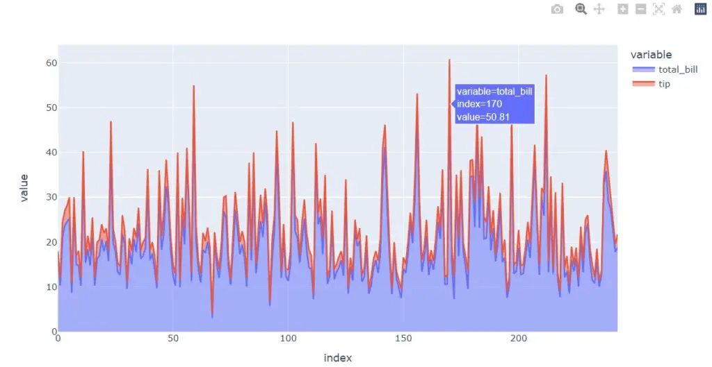
Area plot
df[['total_bill', 'tip']].plot(kind='area')
Bokeh plotting backend for Pandas
Bokeh plotting backend for Pandas currently supports — line plot, point plot, step plot, scatter plot, bar plot, histogram, area plot, pie plot, and map lot.
There are 2 ways you plot Bokeh backend plots using Pandas — df.plot_bokeh(kind=’scatter’) or df.plot_bokeh.scatter(). We will be using df.plot_bokeh(kind=<type>) syntax.
Installation & set up
To use Bokeh as a plotting backend for Pandas, we need to install the pandas-bokeh library.
pip install pandas-bokeh
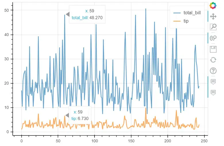
Line plot
df[['total_bill', 'tip']].plot_bokeh(kind='line', alpha=0.7);
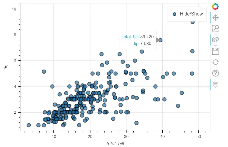
Scatter plot
df.plot_bokeh(kind='scatter', x='total_bill', y='tip', alpha=0.7);
Bar plot
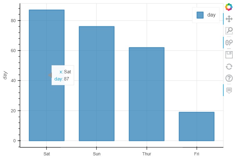
df['day'].value_counts().plot_bokeh(kind='bar', alpha=0.7);
Histogram
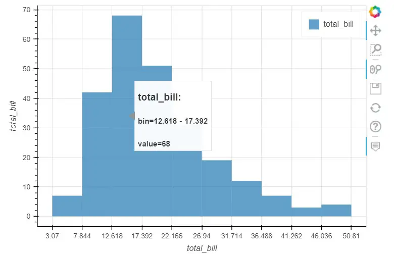
df['total_bill'].plot_bokeh(kind='hist', bins=10, alpha=0.7);
Area plot
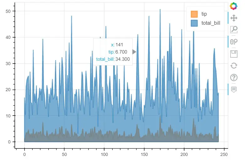
df[['total_bill', 'tip']].plot_bokeh(kind='area', alpha=0.6);
Pie-chat
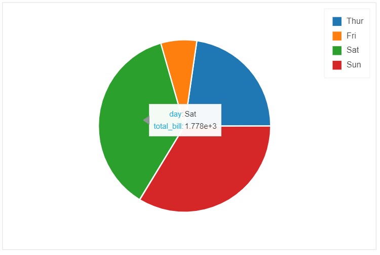
df.groupby('day')['day', 'total_bill'].sum().reset_index().plot_bokeh(kind='pie', x='day', y='total_bill');
In this article, we talked about how to use Plotly and Bokeh plotting backend and generate interactive plots directly on Pandas. Hope you found this article useful.

